
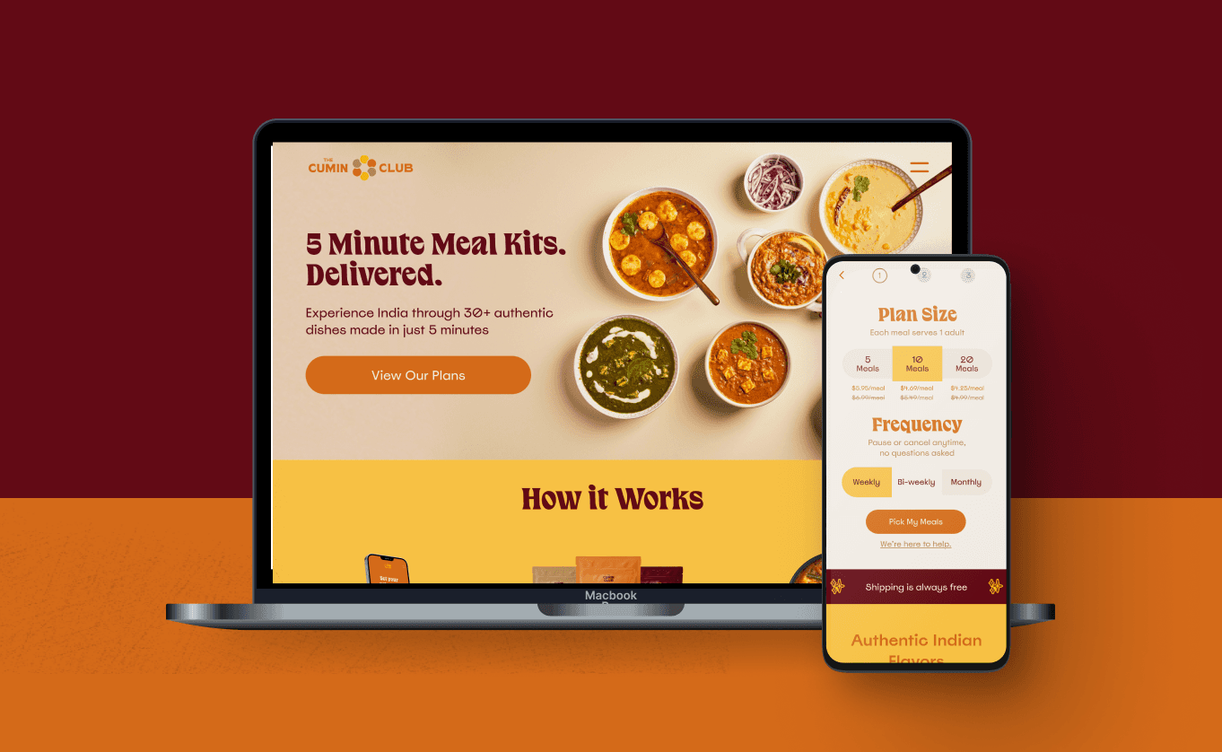
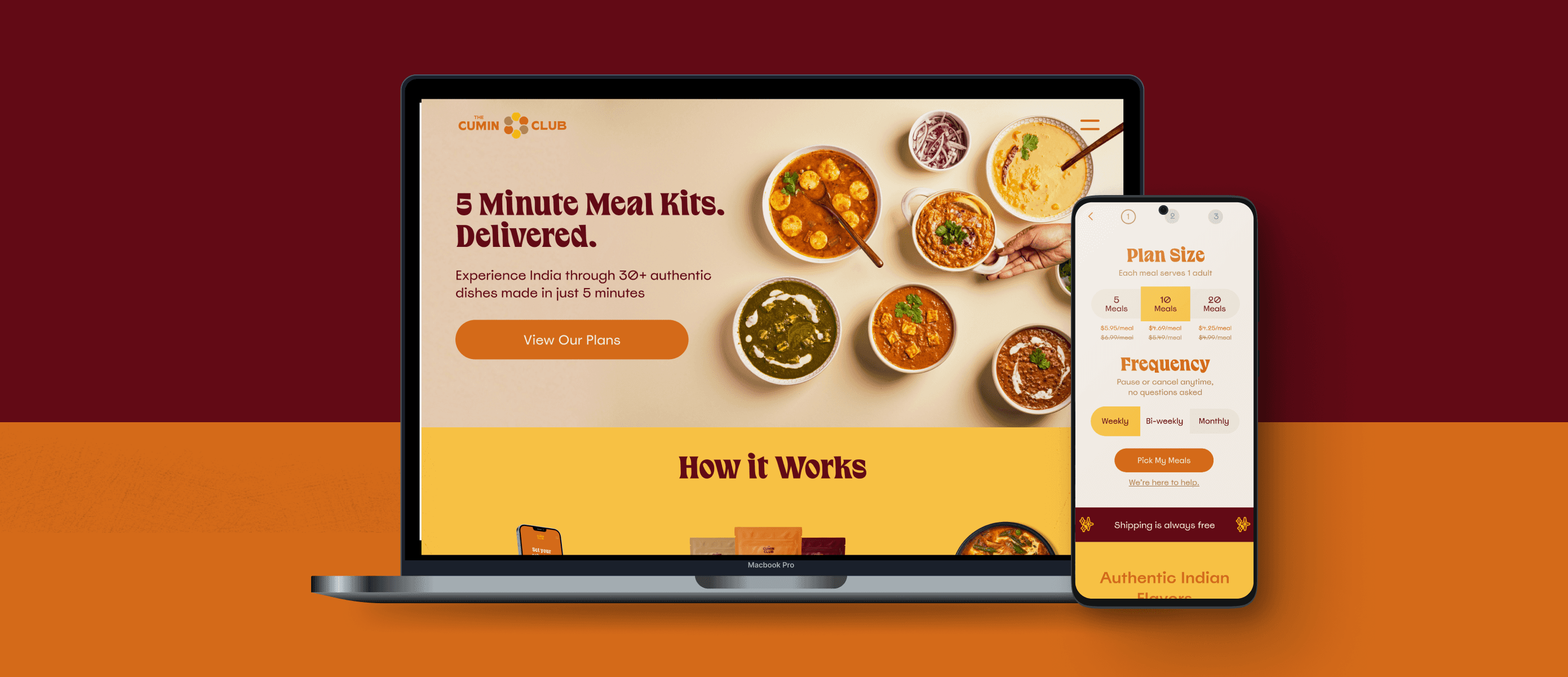

Redesigning a Meal Kit Subscription Experience for Conversion
Scope
Complete responsive website redesign for desktop, tablet, and mobile
Role
Lead Product Designer
Duration
14 months (Nov 2021 - Dec 2023)
Team
2 Founders, Development Team, Investor Creative Team
I led the complete redesign of The Cumin Club's e-commerce platform. The work spanned research, design, a chaotic post-launch stabilization, and post-launch features that opened new revenue streams. Conversion rose from 3% baseline to 4%, a 33% relative improvement.
33%
conversion improvement
16%
click-through rate increase
10%
session duration increase
The Cumin Club delivers regional Indian dishes prepared by expert chefs, freeze-dried, and shipped to your doorstep. Customers prepare meals in 5 minutes with hot water.
The company had just completed a rebrand and needed to scale beyond word-of-mouth growth. The challenge: make the product immediately clear to new visitors while maintaining the brand identity investors had established, then optimize the subscription flow to reduce friction and drive conversion.
Business Goals
01
Establish consistent branding across all touchpoints and ensure visitors understood what the product was.
02
Expand the customer base beyond core users (Indian expats and Indian-Americans) to people without a cultural connection to the food.
03
Increase conversion rate by at least 1 percentage point.
The Cumin Club's website pre-redesign
Discovery
Competitive Analysis
I analyzed six leading D2C food subscription websites, applying heuristic evaluation principles to identify best practices and usability gaps. I supplemented this with customer reviews from Reddit and Trustpilot to understand what users loved and hated about existing services.
The key takeaway: subscription flexibility was a non-negotiable. Users needed to skip deliveries, pause, and cancel without friction. Any friction here created frustration and negative reviews. This insight shaped every decision I made about the subscription flow.
User Research
I conducted seven user interviews to explore attitudes toward food subscriptions, then synthesized qualitative data with survey results through empathy mapping.
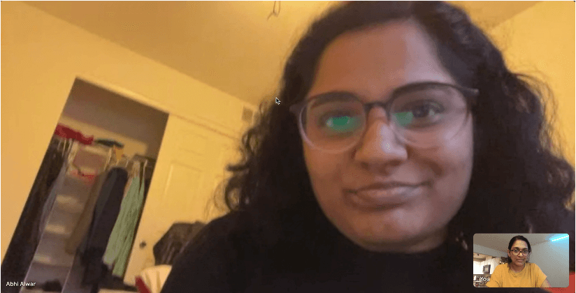
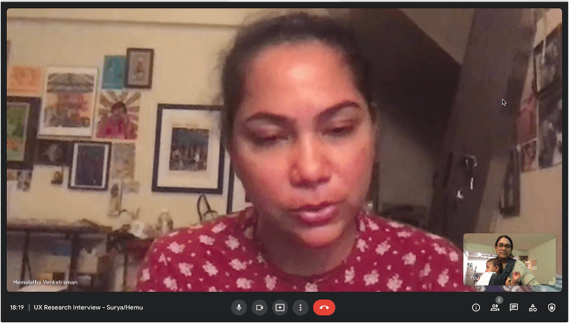
User Research Sessions
Three findings shaped the work:
01
People Didn't Trust Food Subscriptions
Most interviewees wanted to try the product before committing to a recurring purchase. I proposed a one-time-purchase entry point as a potential business model alongside the subscription. The founders shelved it in favor of the existing subscription model.
(Note: The Cumin Club later introduced a one-time purchase option a few years after I left.)
02
"Healthy" Meant Different Things to Different People
Definitions varied widely. Any health-positioning needed to be specific, not generic.
03
Subscription Control was Critical
The ability to skip, pause, or cancel had to be effortlessly available. Hiding these options created the highest-friction moment in any subscription product.
Additional features users wanted (detailed meal plan modification, deeper customization) were documented but deferred for future development.
The Homepage
The investor creative team owned branding and visual identity, including initial wireframes for the homepage and about page. I built the design system around their established patterns and extended it for tablet and mobile using Material Design standards. My primary focus was the account management and subscription experience.
The Problem
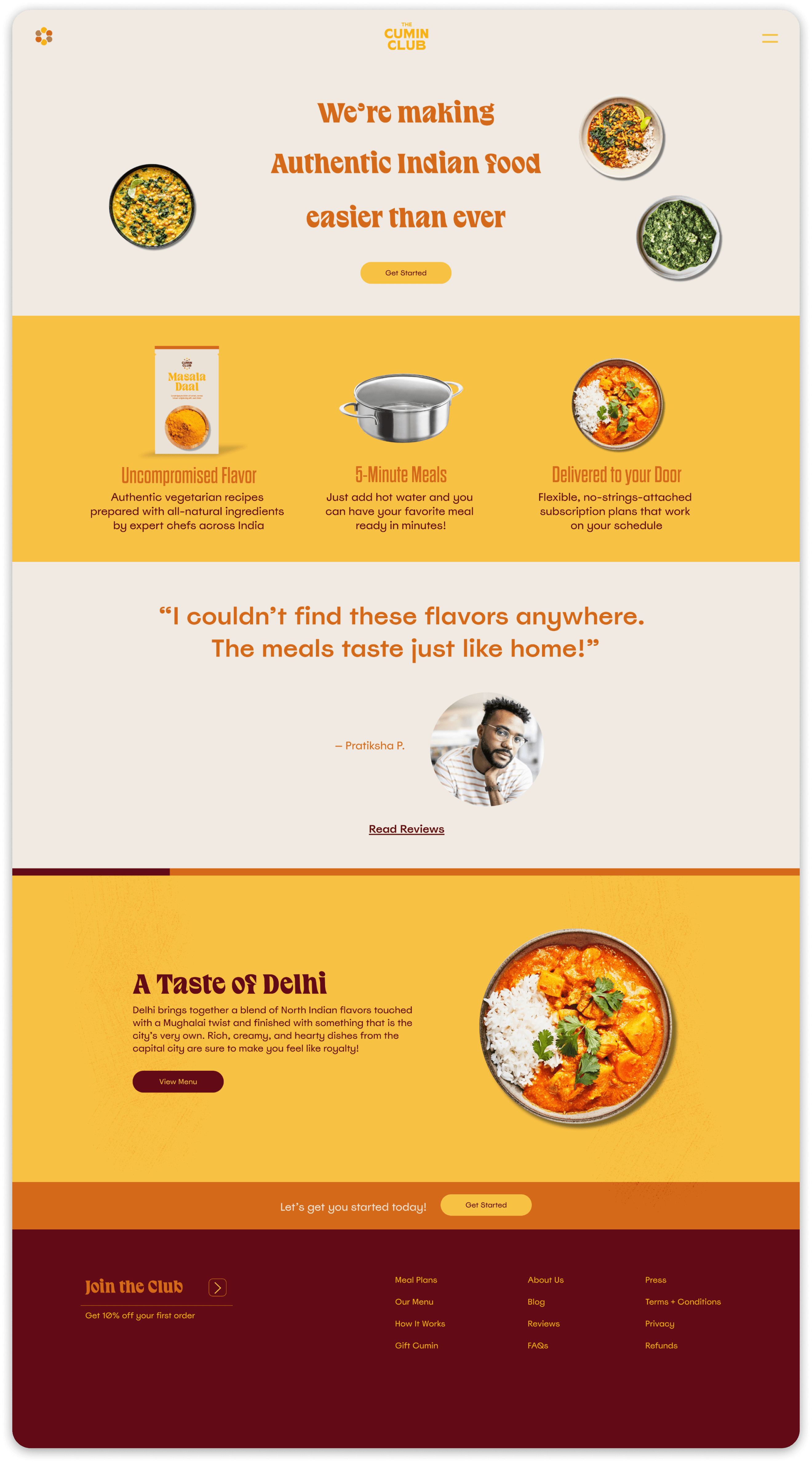
Usability testing on the initial homepage prototype revealed two critical issues. One, users found the homepage unmemorable. More concerning, many didn't understand what The Cumin Club actually offered. Some thought it was a restaurant. Others assumed fresh meal delivery. They didn't realize they'd be receiving meal kits.
The initial design was beautiful and brand-focused. It wasn't converting.
What wasn't working:
Initial Homepage Design
01
Low Visual Energy
The colors and imagery didn't grab attention or convey the vibrancy of Indian cuisine.
02
Unclear Value Proposition
Users couldn't quickly understand what product they'd actually receive.
03
Brand Expression Over Conversion
The initial design prioritized brand storytelling but didn't guide users toward the subscription flow.
In addition, complex scroll animations were causing jank and loading issues, particularly in mobile, where most of our traffic came in from. Building out the initial prototype with this had consumed a lot of development cycles.
My Proposal
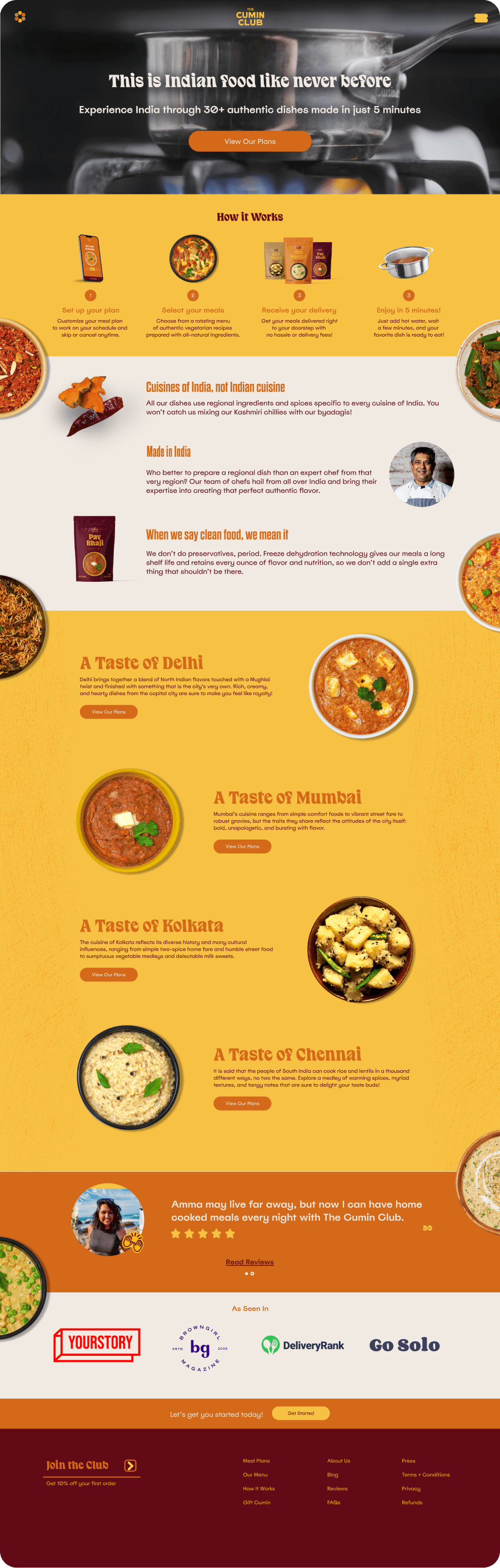
I had usability testing evidence the homepage wasn't working, so I proposed an alternative: keep the visual assets and brand identity the investor team had established, but reorganize the homepage to prioritize conversion without losing brand expression. The founders chose this approach. It could be built faster while solving the clarity problem testing had revealed.
The Solution
Proposed Homepage Design
01
Vibrant Color Palette
Brighter colors that grabbed attention and conveyed the energy of Indian cuisine.
02
Ambient Video Hero
I collaborated with the investor creative team on a video background showing meal preparation, solving the "what is this product?" confusion immediately.
03
Explanatory Copy
A new "How It Works" section took center stage after the hero to reinforce the video.
04
Static Sections
Complex scroll animations gave way to simpler static sections, reducing dev lead and avoiding loading issues.
04
Micro-Animations on Scroll
The food became the focus, with subtle rotating motions that added life without overwhelming the page.
The new homepage tested better with users and was used for MVP.
Homepage Evolution
The homepage went through four iterations throughout the whole process, each solving a specific problem revealed through testing and real-world performance.
Version 1: Investor Wireframe
Brand-first, no clear product clarity
Usability testing revealed product confusion. Users didn't understand they were buying meal kits. Existing users found the update underwhelming.
Version 2: MVP Homepage
Added video hero and "How It Works" to solve product confusion
My proposal reorganized content to prioritize conversion without losing brand expression. Ambient video hero showed meal preparation to solve the clarity problem. Added a 4-step "How It Works" section, social proof, and more food photography.

Version 3: Post-Launch Fix
Replaced video with static hero to fix mobile loading; tightened "How It Works"
The video caused mobile loading issues, so I replaced it with a static hero while we ran a new food-focused creative shoot. Compressed the "How It Works" section from 4 steps to 3. Reorganized sections and added a Gift section.
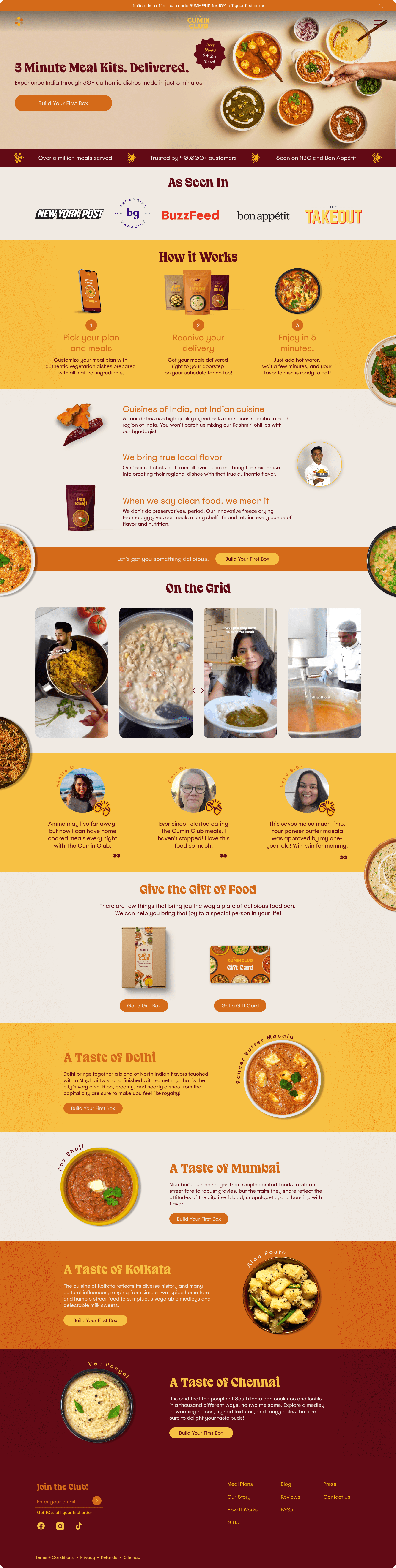
Version 4: Final Iteration
Updated imagery, reorganized social proof, added UGC section
Updated imagery and social proof. Reorganized sections to improve social proof and introduced a UGC section. Balanced brand expression with conversion optimization.
Subscription Flow
The homepage got users in the door. The subscription flow was where conversion happened.
Research had revealed users wanted customization but feared commitment. The design challenge: balance control, flexibility, and information without creating overwhelm, friction, or cognitive load.
Design Strategy
Three tensions to resolve:
01
Control vs. Overwhelm
Provide filtering and customization options without creating decision paralysis.
02
Flexibility vs. Friction
Allow plan changes without creating navigation loops.
03
Information vs. Speed
Surface key details (dietary info, spice levels, portions) without slowing the path to checkout.

Subscription Flow low-fis
I designed a responsive subscription experience that adapted to mobile, tablet, and desktop while maintaining consistent interaction patterns across devices.
The key screens included:
Plan Selection:
Subscription options with pricing, frequency, and what's included.
Menu Browsing:
Visual menu with filters for dietary preferences, spice levels, and available tools.
Cart & Checkout:
Streamlined checkout with order summary, delivery information, and payment.
A Post-Launch Insight
Analytics showed users moving back and forth between subscription steps 1 and 2, changing box size or dropping off. The hypothesis: users wanted to adjust box size while verifying cost per meal, which changed based on selection.
I combined steps 1 and 2 into a single page, using anchor point scrolling to manage information load. Users could now see pricing update in real time as they adjusted their box. Drop-off reduced.
Component Design
The investor creative team provided initial desktop wireframes based on the brand book and guidelines. My role was to extend these patterns to tablet and mobile, apply interaction design, and build the subscription experience.
The brand system had constraints I couldn't change for the MVP, including some typography and contrast choices. I flagged these to the founders and the investor team. Launch deadline meant they were carried into MVP. I focused my attention on the components and interaction patterns I could control.
Meal Cards
The meal card surfaces key decision factors (dietary compatibility, spice level, portion details) while allowing immediate quantity adjustment without leaving the browse context.
Single meal cards show dietary descriptors, bestseller badge, add/remove options, and access to more information.
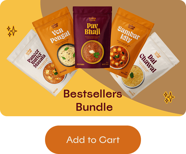
Bundle cards use a simpler structure of a product image and a single CTA to promote curated meal sets.
Post-purchase, meal cards become read-only confirmations without edit controls.
The card adapts to screen context:
Desktop: 5 cards per row with a persistent filters sidebar.
Tablet: 5 cards per row with collapsed filters.
Mobile: 2 cards per row optimized for thumb interaction.
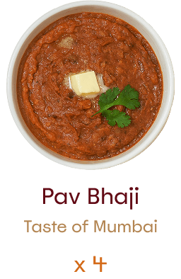
Single Meal -
Post-purchase

Single Meal card -
Menu selection - MVP
The meal card surfaces key decision factors (dietary compatibility, spice level, portion details) while allowing immediate quantity adjustment without leaving the browse context.
In later iterations, the "taste of" line was changed to a 3-4 word short description of the dish. This was in response to users dropping off quickly upon clicking "More Info".
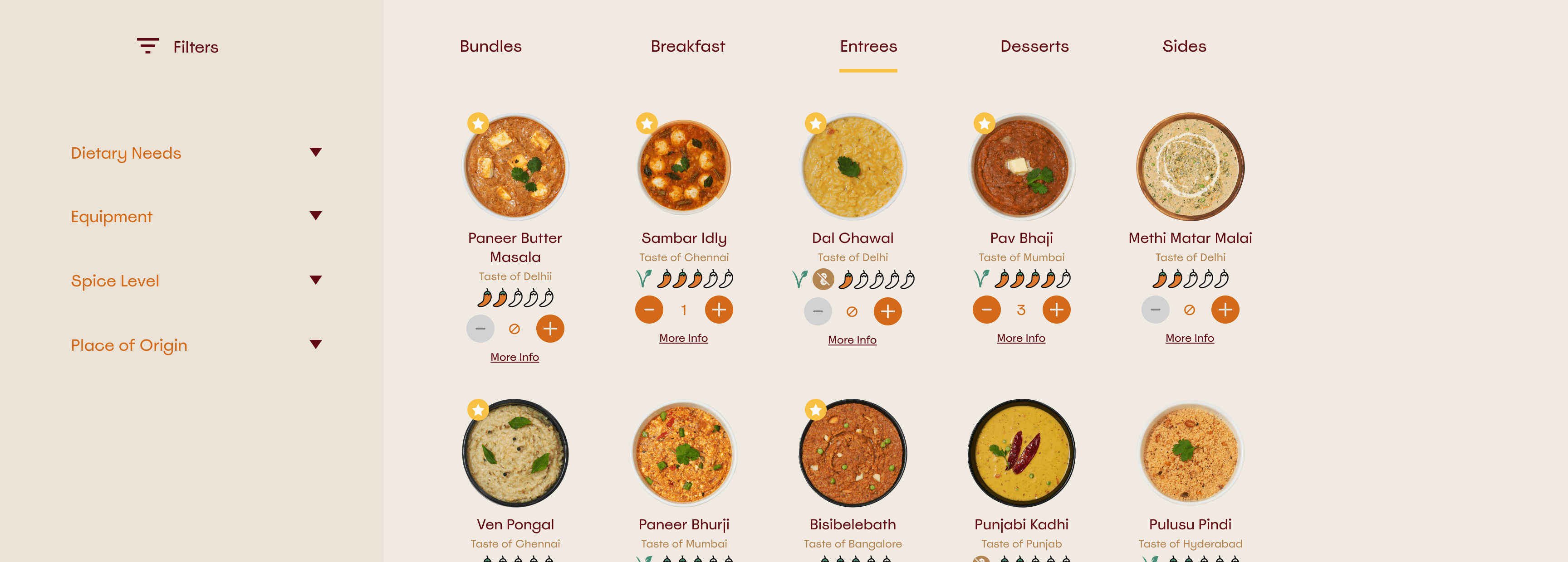
Persistent filters reduce available width in Desktop
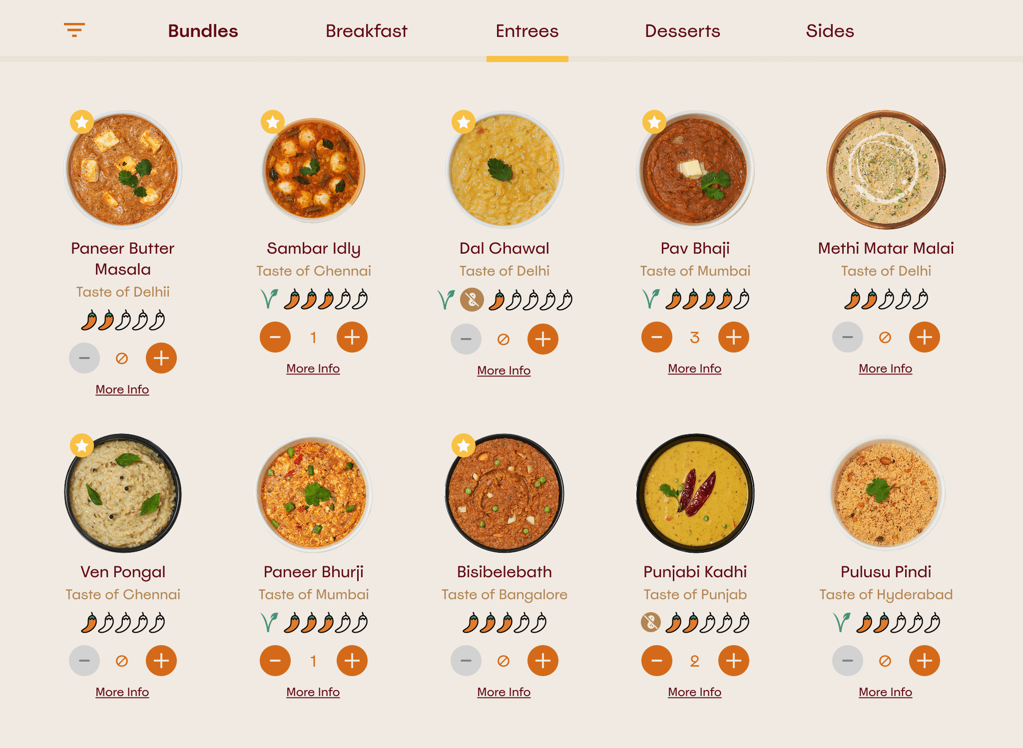
Collapsed filters allow 5-column grid in Tablet
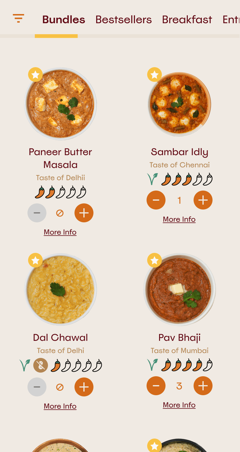
2‑column Mobile grid shows more at a glance without overwhelming users
Cart Evolution
The cart transforms across breakpoints based on interaction context and available real estate.



Mobile users interact with a bottom-anchored bar optimized for thumb reach, progressing through three states: empty (bestsellers offer), partial (dynamic feedback showing items remaining), and full (enabled checkout).
Desktop and tablet users see a collapsible left sidebar that provides cart context when opened and allows free browsing when closed.
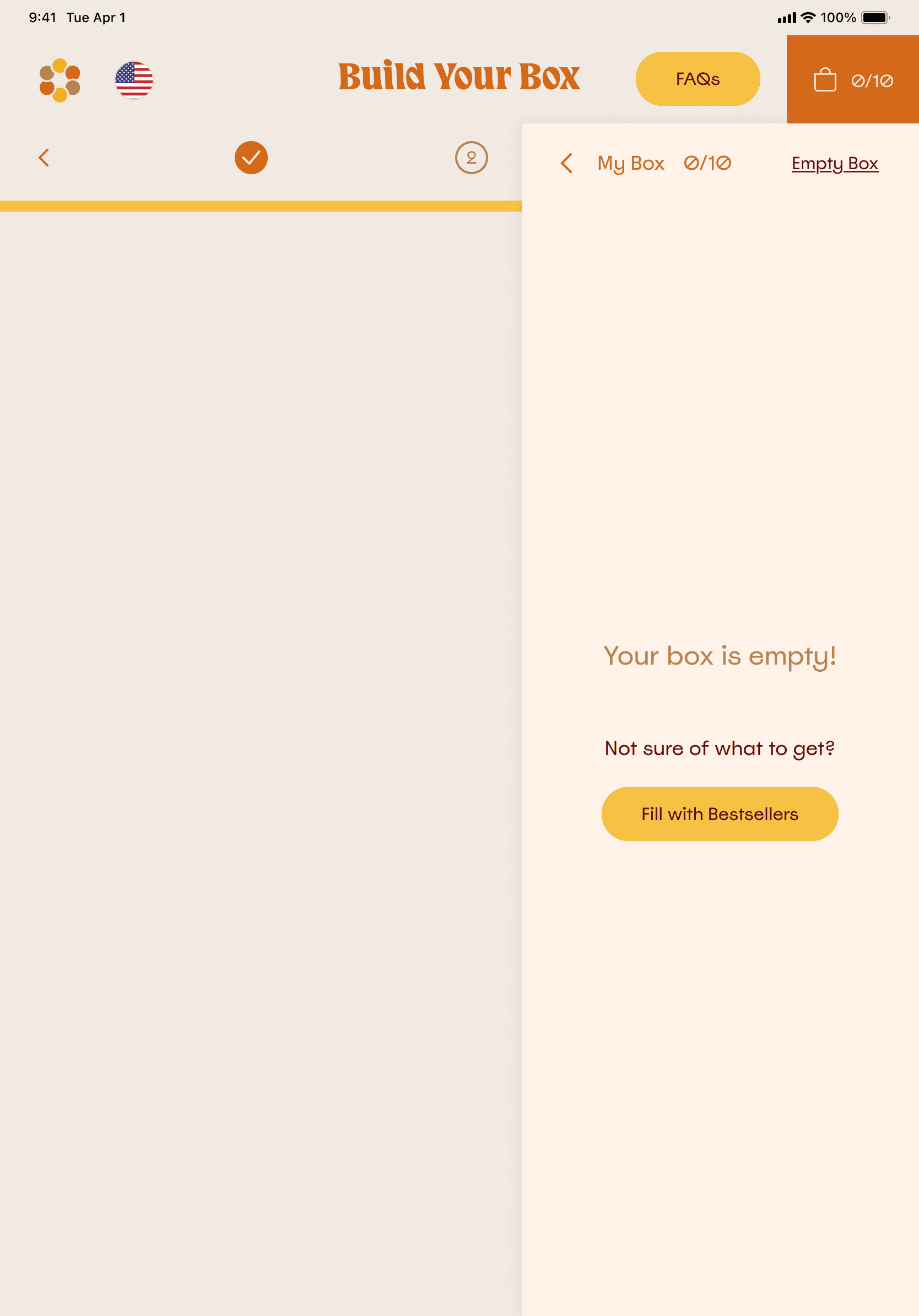
Tablet wireframe - empty cart
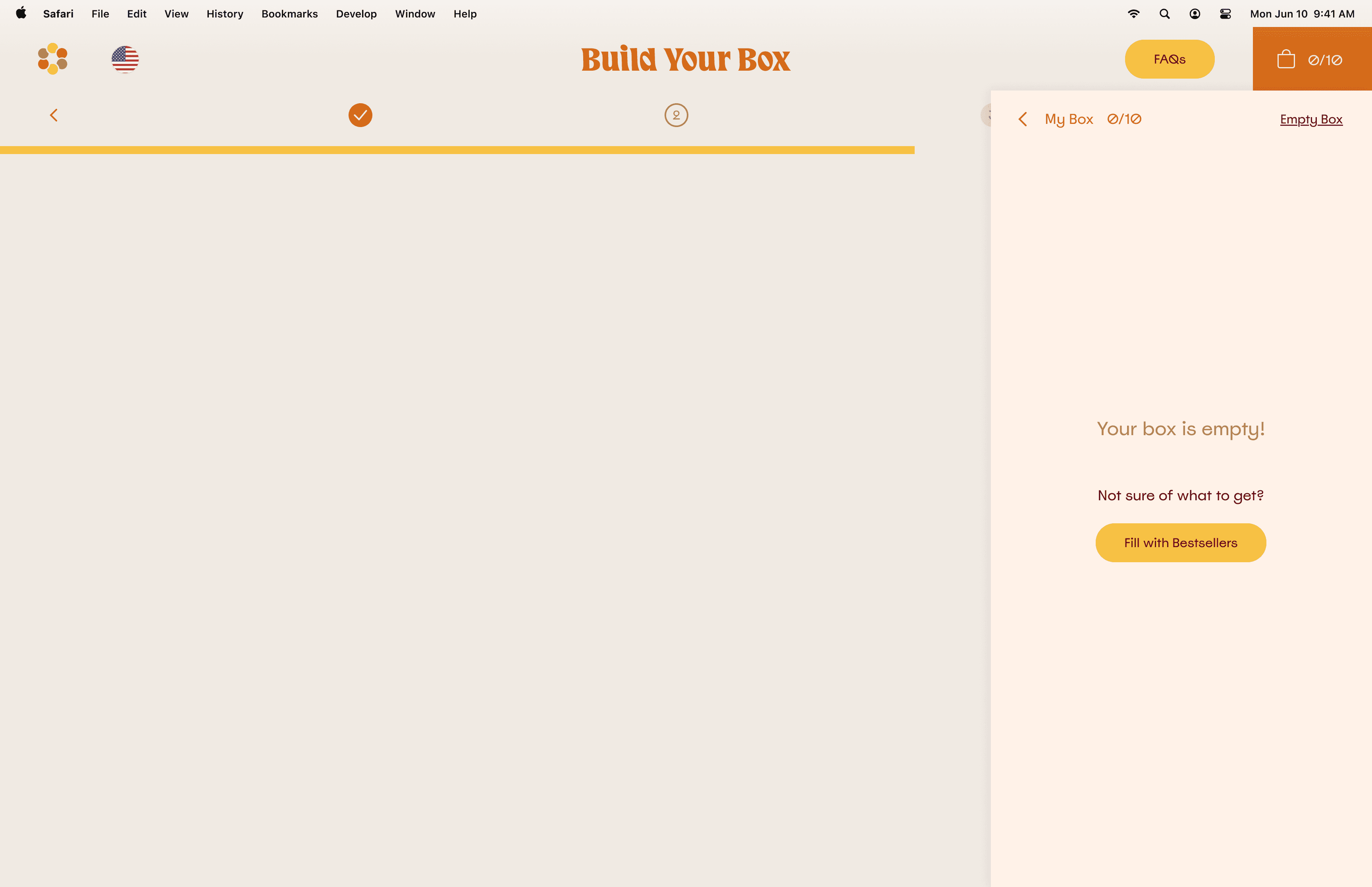
Desktop wireframe - partially full cart
Progress Indicator
The subscription flow progress indicator shows completion status across three steps, with clear indication of which step is current, complete, and incomplete.



We launched in August 2022. Within days, technical issues disrupted the user experience. Conversion dropped from 3.0% baseline to 2.2%.
We moved into stabilization mode immediately. Bug tickets came in fast. The division of labor was clear: developers handled technical issues and the Stripe integration. I handled what was in my wheelhouse, working from session recordings and analytics to identify where users were dropping off.
The three problems I worked on:
01
The Hero Video
The video I had pitched and tested well wasn't loading properly on most mobile devices. Users bounced before seeing the subscription entry point. I replaced it with a temporary high-quality static image while we shot new food-focused creative for a permanent replacement.
02
Animation Complexity
I temporarily removed scroll animations to reduce technical load until core functionality stabilized.
03
Subscription Step Dropoff
Session recordings showed users oscillating between steps 1 and 2. I combined the steps into a single page with anchor scrolling, which is the change I described earlier in the subscription flow section.
The hardest calls during this period were reversions. Several interactions I had designed for the launch had to be rolled back to their pre-redesign versions to keep the site light. In a crisis, something that works matters more than something that tells a brand story. Stories can be told many ways, functions have to operate.
Critical bugs were resolved within 2-3 weeks. Over the following four weeks, conversion climbed as the experience stabilized.

What stood out most was Surya's ability to stay calm under pressure and find solutions quickly. When we faced unexpected technical challenges after a major redesign, Surya worked side-by-side with our engineering team to stabilize the experience while maintaining our design vision. Her collaborative approach and bias toward action made a real difference.
Ragoth Bala
Co-founder, The Cumin Club
After stabilization, the work shifted from crisis to expansion. Two post-launch features emerged from listening to operational data and user feedback.
Cart Redesign: Making Sides Optional
Every meal originally came with free sides: rice, rotis, chutney, or papad. User feedback revealed many customers weren't using them. The business was absorbing significant costs for items going to waste.
The challenge: give users more control while reducing costs, without disrupting the core subscription journey.
I redesigned the cart to make sides optional add-ons:
Marketplace Integration:
Users could browse and add sides from the product catalog.
Smart Suggestions:
When users added meals, the system displayed associated sides as suggested add-ons.
Separate Pricing:
Sides became individual purchases rather than bundled items.
No Flow Disruption:
The core subscription journey remained unchanged.
The change reduced costs for the business while giving users more control.
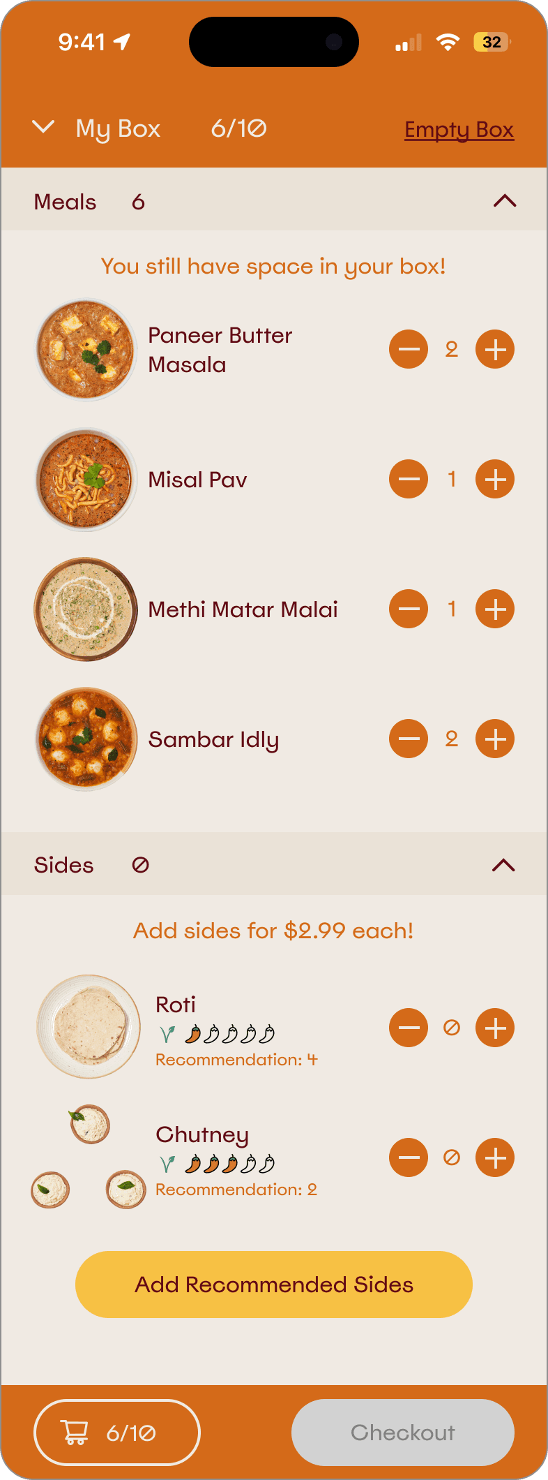
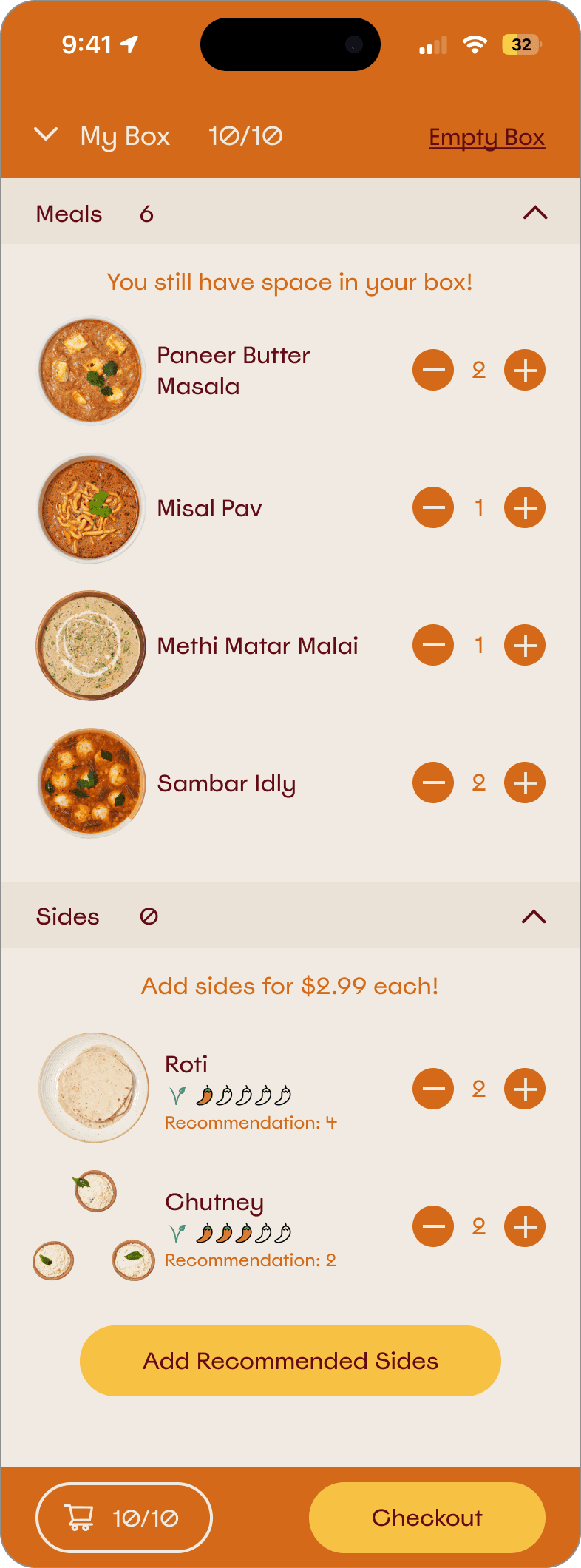
Cart Redesign - Mobile
The Cumin Pantry: A New Revenue Stream
User feedback indicated demand for authentic Indian snacks and beverages. The founders saw an opportunity to expand the offering and increase order value.
I designed:
A New Marketplace Page:
Product catalog with cards, descriptions, and imagery for Pantry items, including sweet and savory snacks, teas, and coffees.
Strategic Placement:
Positioned at the end of the subscription flow as a "before you go" moment
Cart Integration:
Seamless addition of Pantry items to subscription boxes
Clear Subscription Messaging:
Copy clarifying that Pantry items would recur in subsequent boxes unless changed, addressing potential confusion preemptively
The Pantry feature increased average order value and created a new revenue stream.
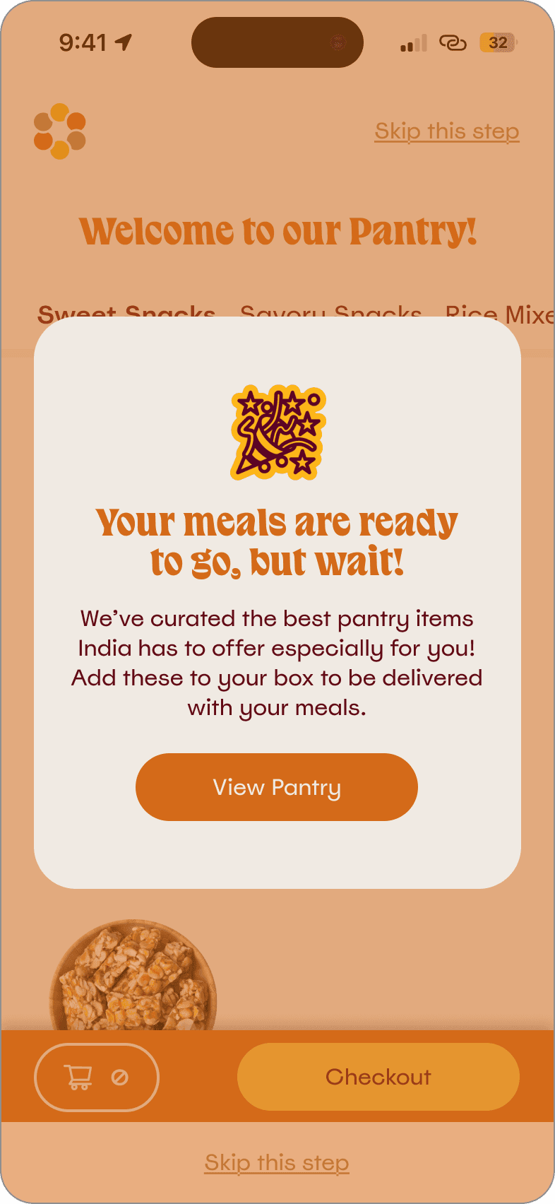
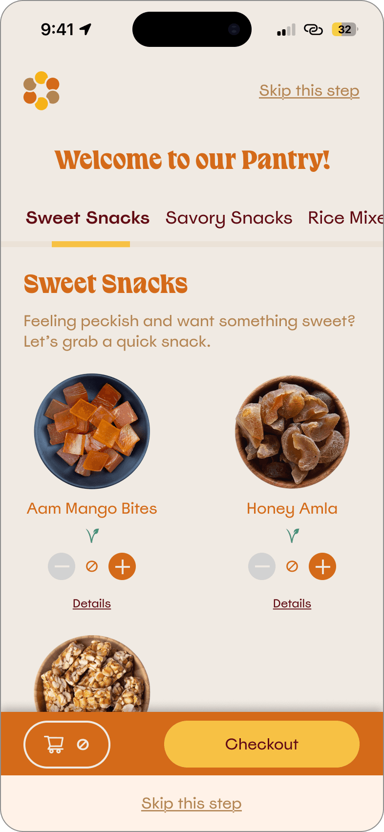
The Cumin Pantry - Mobile
Reflections
01
Ship and Iterate Beats Wait for Perfect
We launched with a solution that worked in testing but revealed performance issues at scale. Post-launch analytics and session recordings taught us things pre-launch testing couldn't. Monitor closely, identify issues fast, iterate on real data.
02
Technical Constraints are Design Constraints
The video hero solved a clarity problem and created a performance problem. Design doesn't exist independently from the systems that deliver it. Understanding technical reality early prevents late-stage compromises that degrade user experience.
03
Crisis Demands Ruthless Prioritization
Stories can be told many ways. A function has to operate. When the choice was between a designed interaction and a working one, working won. Knowing which calls are ruthless and which are precious is part of the job.
04
Listen to Operational Data after Launch
Both the cart redesign and the Cumin Pantry came from listening to what was happening after launch, not just what users said in interviews. The best designers stay close to operations after shipping, not just before.
05
Collaboration across Teams is the Job
The investor creative team owned brand. I owned product. Developers had limited bandwidth. Founders moved fast. Working within these constraints, sometimes around them, required ongoing communication, strategic persuasion using evidence, and judgment about when to push back versus when to adapt.